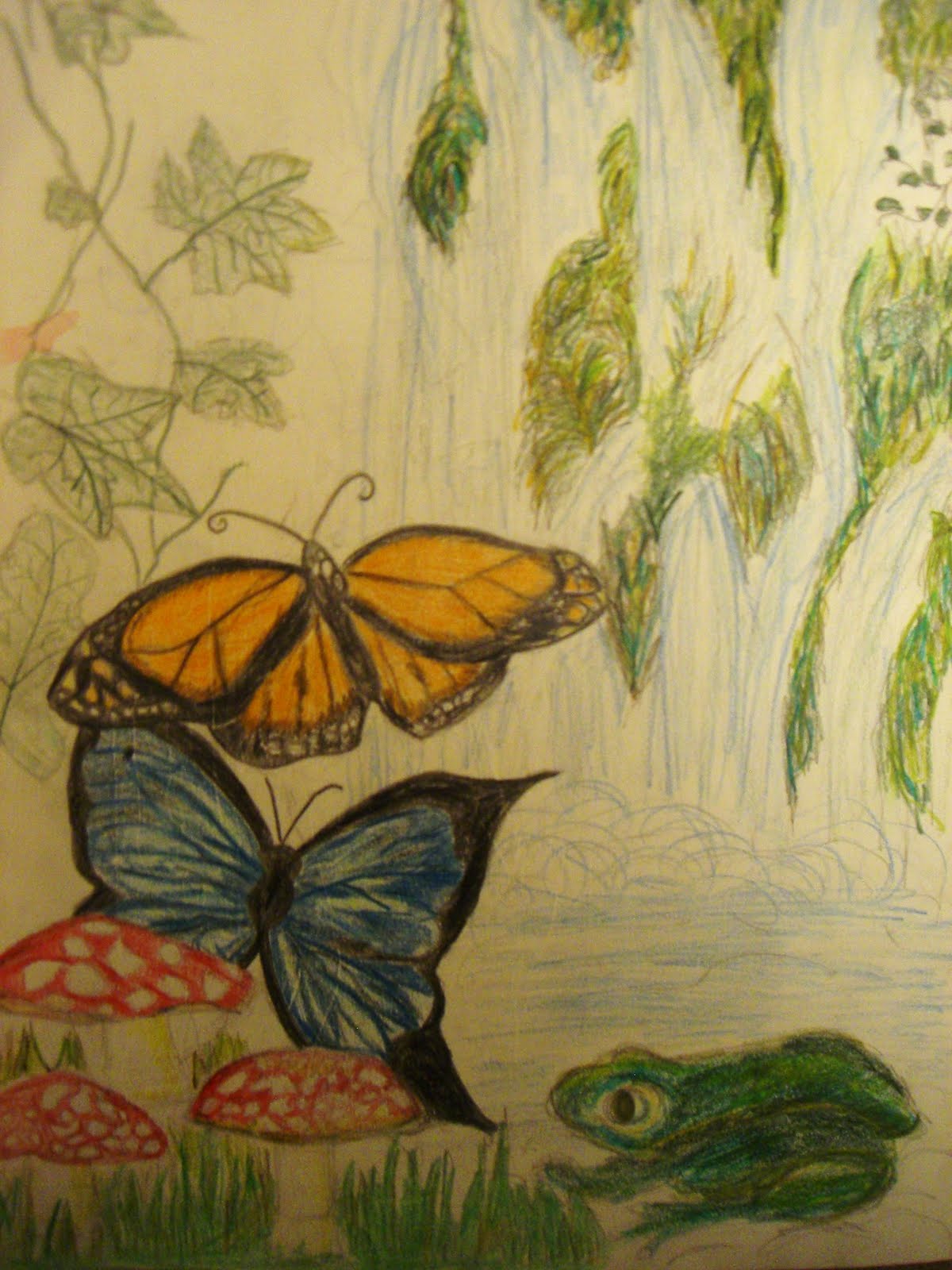
Originally I planned to do a project based around maps and how they seem to flow and be continuous, and about bieng lost. I made the above collage to try and capture what I wanted but found that it did not 'flow' in the way that I wanted. However as i looked at the picture in the bottom right hand corner more and more, i saw that the tree branches looked like the roads on the map, and ocnsidered how like a map, a tree takes a journey through time as it grows. I also took into account how the tree and the map juxtapose each other in that one is man made and the other is natural, as as trees were used for trails by hunters in the past and by some tribes even today, thier link to maps is not simply that the map is made from paper. I wanted to shows this link between the natural and the man made, and how they are more closely linked than one assumes.
 I decided to take images of people travelling, depicting the emotions associated with bieng lost or scared. I decided to take these on a cold path in the winter, on the deserted chevin near my home. I chose this as it held a kind of pathetic fallacy, as the cold/scared feeling one feels inside when one is lost is shown in the landscape aswell. I wanted to see if i could join together the natural and the man made with man bieng the 'mediator' between the two, with the connection to both.
 This is an example of one of my own photographs of trees and the 'nature' aspect of my project. I decided to take these pictures when is was a little warmer, and a little more green, as this shows the renewal of nature in contrast to the drab man-made colours.
 As trees live a very long time, they themselves convey a histor. I wanted to show this by combininig a piece of art history and a tree, again combining the man-made and the natural, and seeing how they are linked to each other. The person contained in the tree is a copy of Pellegrino Tibaldi's original sketch of man opening door in Sala Paolina combined with an image of a tree , both in line form to look like the man is growing from the tree and out of nature.
 This is my favourite image of the ones I took as I liked the curves and the form of the tree. I also liked the way it grew and branched out in many directions, much like a map.
The above shows my experimentation with combining the natural and the man made and the journey they take to link to each other. I originally had the idea of representing this like a 'thought' coming out of the girls brain, as a thought process or a mind map, to me, is a journey in itself towards coming to a conclusion. I liked this idea, however to me the division between the natural and the man-made was too great and they needed to be more closely linked, in order to show what I saw in my own head.


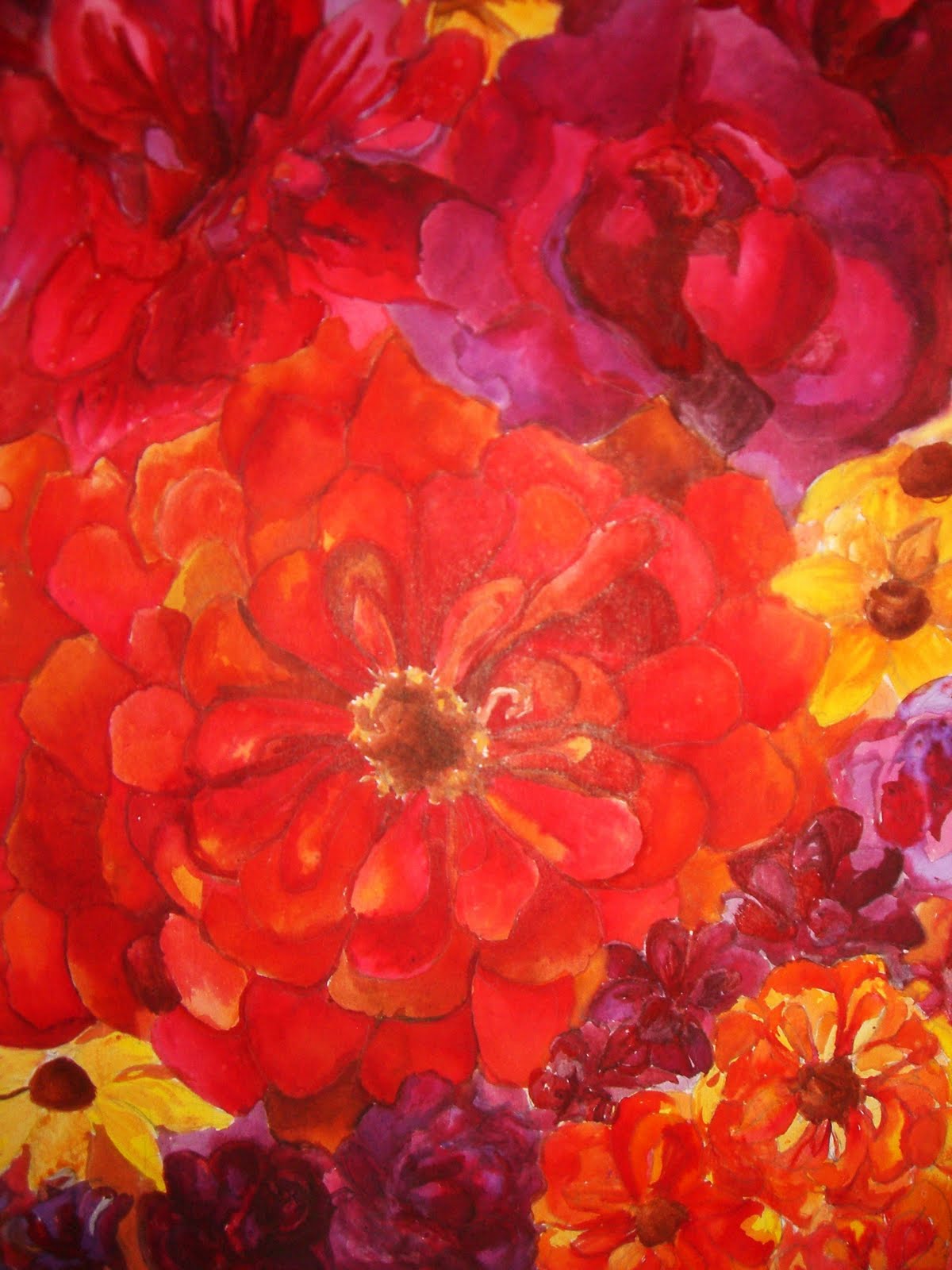
 After thinking about how I would join the natural and the man mae, I came up with the idea of making the natural from the man-made. I did this by making a tree from the maps by collaging small pieces of map into the shape of one of my tree photographs. I then wanted to contrast this against something blatently natural in the form of blooming flowers. On the one hand I did this to give a continuity from my previous projects and show the journey I had made over the past year in discovering my strengths and weaknesses in art, but on the other hand to show the contrast between the harsher man made and the delicacy of nature.
 The above photographs are of crocus' on a field near my home, which I took pictures of just as they were coming into full bloom and at thier brightest.
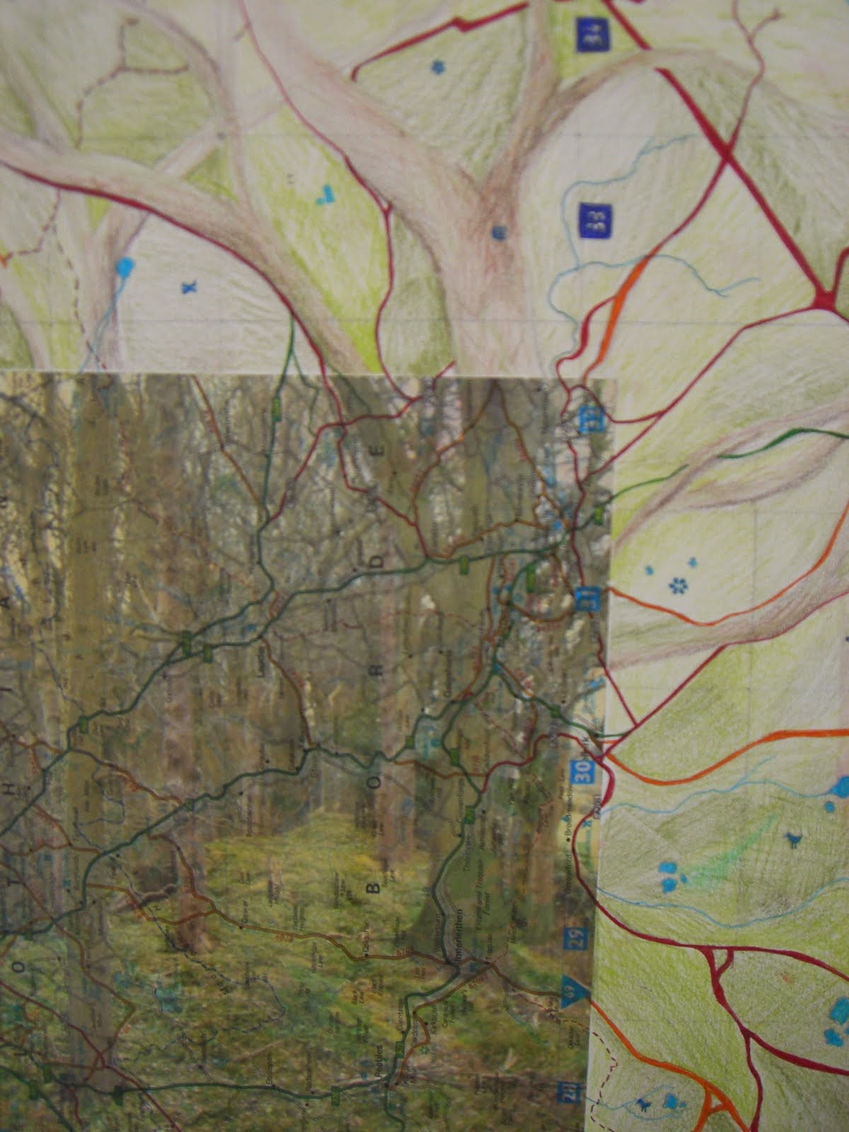
 This is another of my ideas concerning combining the tree and maps. I printed an image of a tree onto some map paper and then extended the branches using ink to show how the trees branches carry on and interweave like the roads of a map. I really enjoyed this technique and decided to experiment further with it as a form of ICT manipulation. The images below show this experimentation using my own images.


 When thinking about 'natural' colours of trees onr usually thinks browns and greens. I thought that this needed to change if I was to truly show the contrast between what is natural and what is not. I took inspiration in concern to this from Mondrian's Red tree the above images are copies of the tree and the below image is one of my own images done in the style of Mondrian. Although I liked the outcome, I did not think it to be delicate enough for what I was trying to capture.
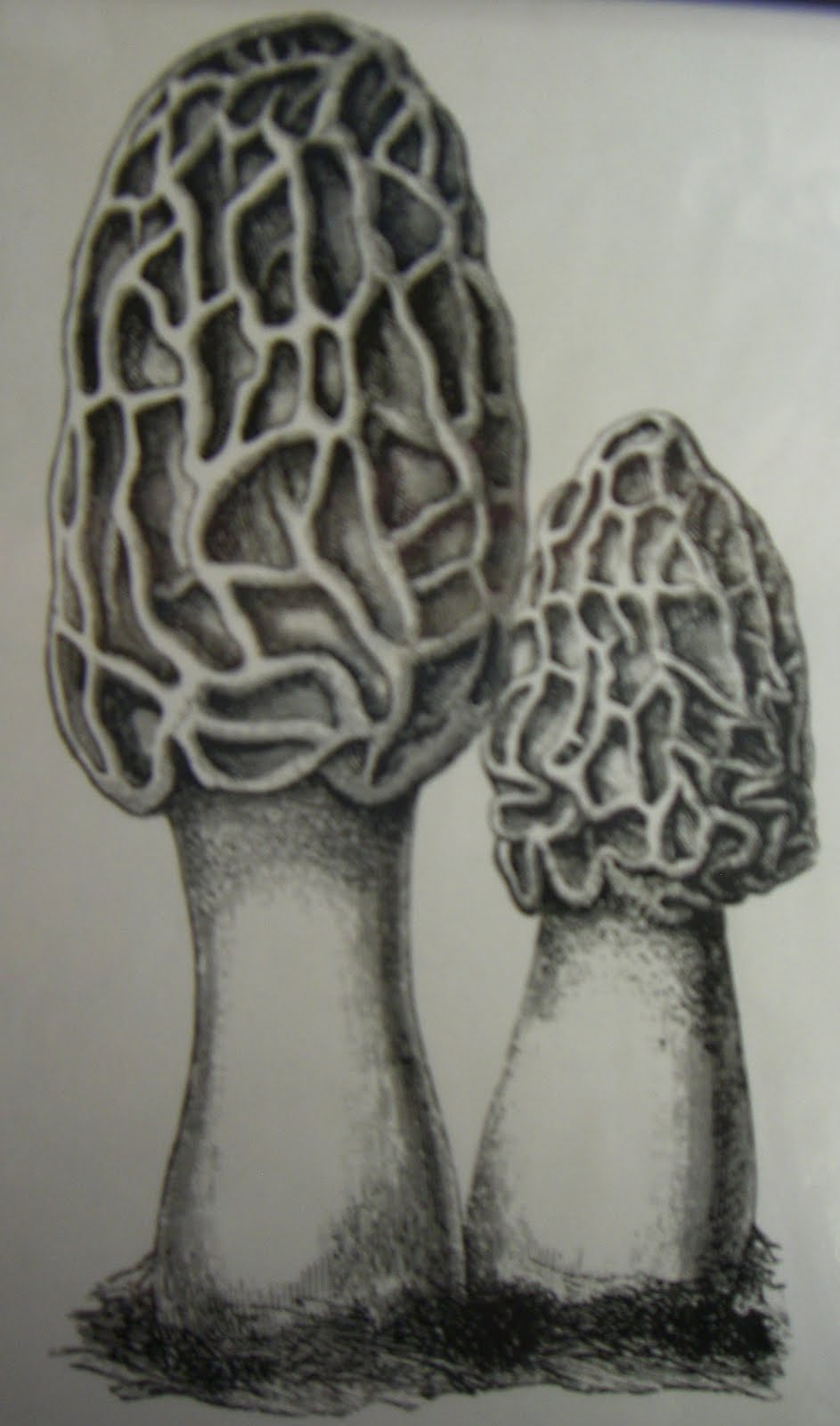
 After finding the harsh 'Mondrian' colours not delicate enought, I decided to to a tree in biro using cross-hatching in order to provide the delicate detail I was looking for. I found this to be very successful, but found that this did not work on canvas and worked best on a smaller scale to that which I wanted.
 This picture is copies of the photographs I took of my friend Elly, placed to look like a tree trunk. Again I liked the effect this gave, but found that it was very difficult to get the images small enough , in enough detail, and to the desired quality to make them into branches. But the thought of combining the people and the tree remained in my head.
 Above is my copy of another tree by Mondrian. Unlike the red tree, this one looks far more constructed and man-made. Although I liked the effect it gave I did not like that the delicacy of the tree was lost, but it gave me the idea of possibly distorting another part of my piece to makeappear more man-made.
 The above is a copy of a tree by Mikel Robinson, which to me shows the journey a tree takes from underground to above the ground. I liked this idea of combining the before and after, and it gave me the idea of doing two canvas' both containing man-made and natural but each slightly differently.

 I wanted to experiment with how I would put the people onto the canvas, and choosing what media to do this with. The above is an experiment with ink. I liked the darker colours and melancholy feel the ink gave, but did not like the lack of definition, which worked with flowes but not with people.
 This is one of my experiments with ICT (man-made) and my photograph of a tree. I decided to extend the tree into a map making the map the main feature instead of the tree.


 This canvas is a culmination of all of my ideas concerning the images of people and trees. I made the tree very realistic, putting a lot of detail into it, contrasting to the loss of detail in the people as I made them 'broken' like the Mondrian tree, and making man man-made. I liked the overall outcome of this but felt that my earlier experiment with flowers and maps was more effective.


 This is my finished piece and combines all of my ideas. To me, it shows a continuity from my other projects and how I have developed over this year in the form of the flowers, but the tree shows the journey it took. It also ecemplifies the natural and the man-made in that it shows the contrast between the two, but in such a delicate fashion that the two live in harmony. I used acrylic paint to give the detail and delicacy of the flowers, to contrast to the harsh, broken, collages tree. I then used brusho ink to create the serene blue background. I like the way the flowers become part of the tree by sitting in the branches, looking as through they have grown together over time, yet also bieng very seperate. To me this project took as journey in itself developing from the ideas of an obvious journey of bieng lost, to a journey which happens all aroung everyday which we do not always recognise.